Demo of Product Portal : When an update is available, a small notification in their menu extra alerts users to open Portal.
Demo of Product Portal
iZotope Product Portal Redesign
About the Project
iZotope is an audio software company located in Cambridge, Mass. who designs plugins, hardware, and apps for musicians, producers, and audio-post-engineers. Product Portal is an application which organizes users' plugins.
In redesigning the Product Portal, our client asked for a clearer alignment with iZotope's brand and a new section reserved for educational content. I led the research process, ideation discussions, and designed the 'Learn' tab.
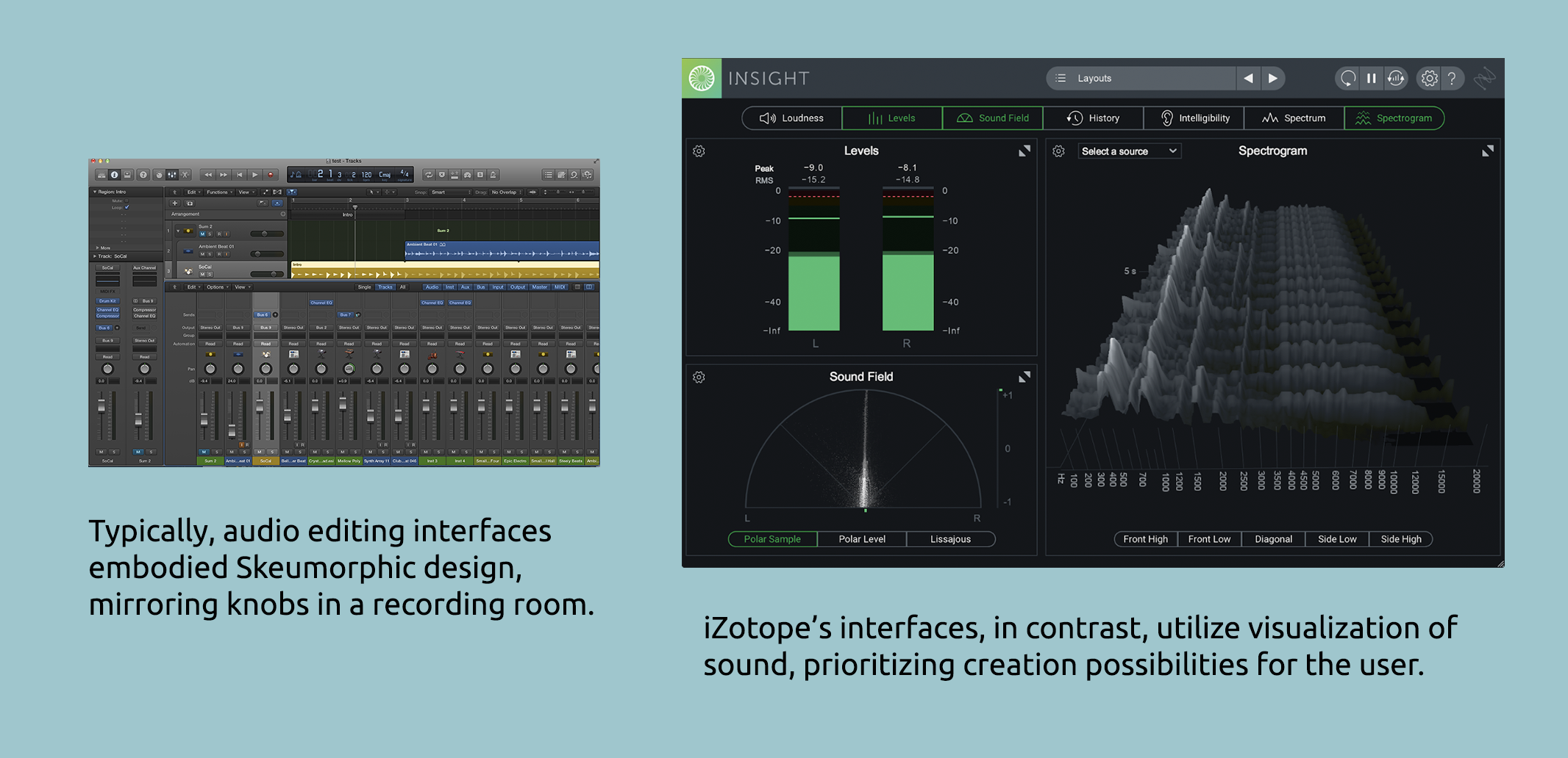
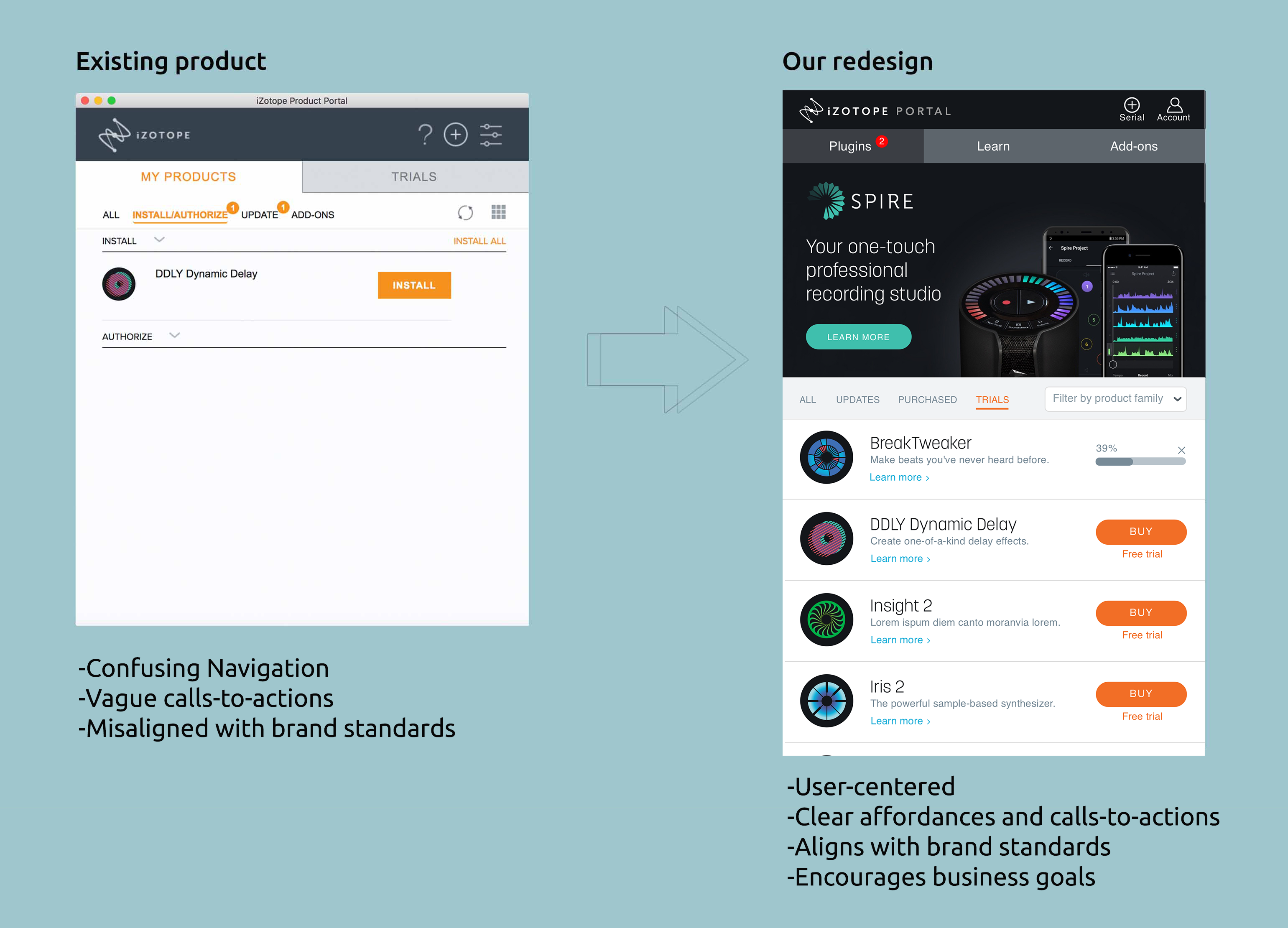
While iZotope has a world class collection of products, they lack a well-functioning access point to organize them. The current Product Portal has numerous empty states and lacks lacks direction, clear affordances, and alignment with the rest of the brand. If users are satisfied with Product Portal's functions and use it consistently, iZotope could steer users towards new products they otherwise wouldn’t be exposed to through banners or suggested plugins.
User Research Defines Goals
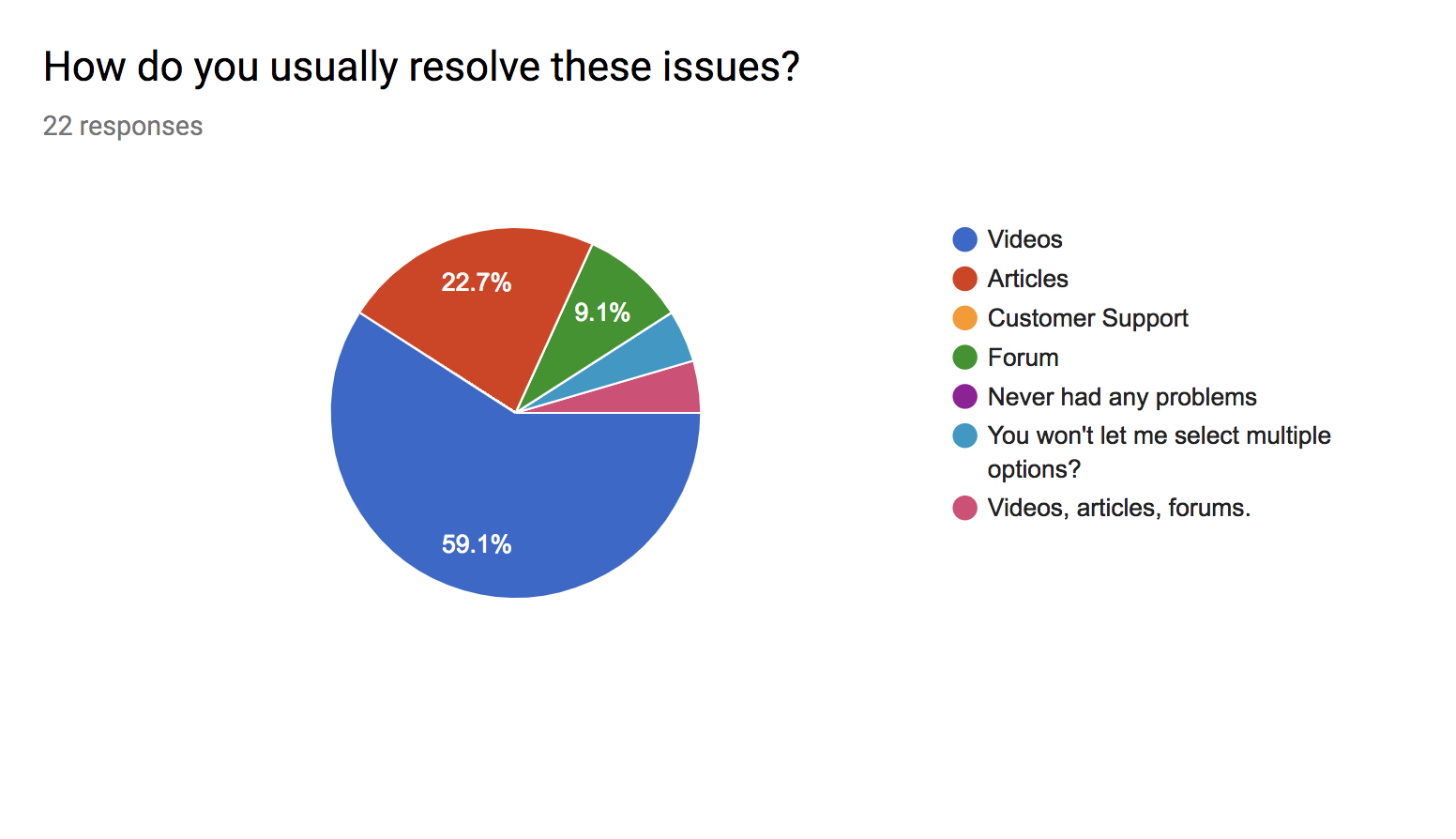
I sent out a screener to seek how users resolved issues with technology. Out of a survey of twenty two musicians, editors, and designers, over seventy-five percent reported that technology had been a barrier in getting work done.
To fulfill our client's goals, the entire application had to feel active and reliable. Since the standalone application would likely be used in conjunction with other apps or web pages, I focused on a vertical design.
Prioritizing Features through Sketching
I wanted each item on the product portal, from the version number to the color of each button to have a specific purpose and intention in aiding the user’s experience and supporting iZotope’s business goals.
To fulfill our client's goals, the entire application had to feel active and reliable. Since the standalone application would likely be used in conjunction with other apps or web pages, I focused on a vertical design after sketching different layout options.
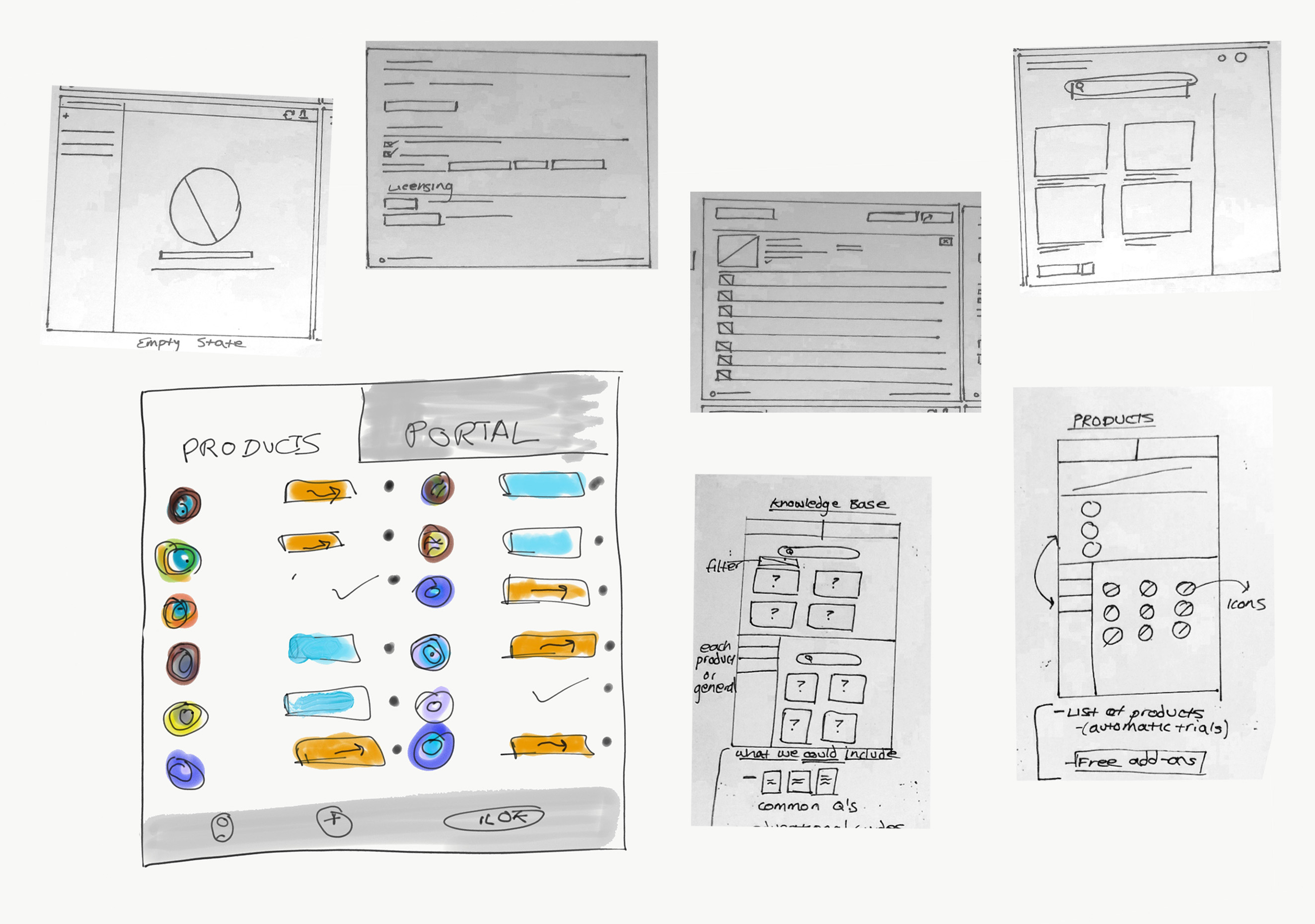
Initial Wireframes Have Four Tabs
Initially we decided to implement both a Knowledge Base and a Video tab, believing each tab served a specific purpose. The Knowledge Base would be where users go if they have a real and pressing technology-related issue.
The Videos tab would be where users could watch tutorials, be introduced to products, and seek new techniques in plugins they owned.
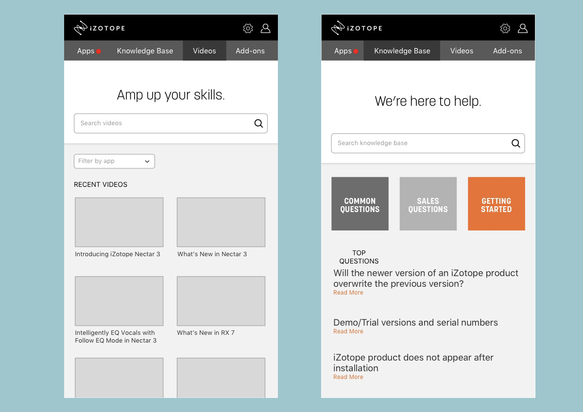
Final Design Iterations: Learn Tab
During testing, users responded unanimously to a 'Learn' page with two clears goals: searching and relevant video tutorials. We also hid additionally information in a drop down menu next to the title of the video, so the interface remained clean. There is also an option to filter the videos by product family.
The new header of the page reads, "Amp up your skills." This active language aligns with iZotope's music technique-focused brand. The search bar text responds to the header by encouraging the user to ask iZotope (or Product Portal) any question they have.
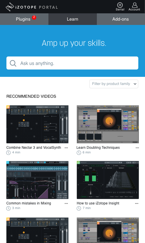
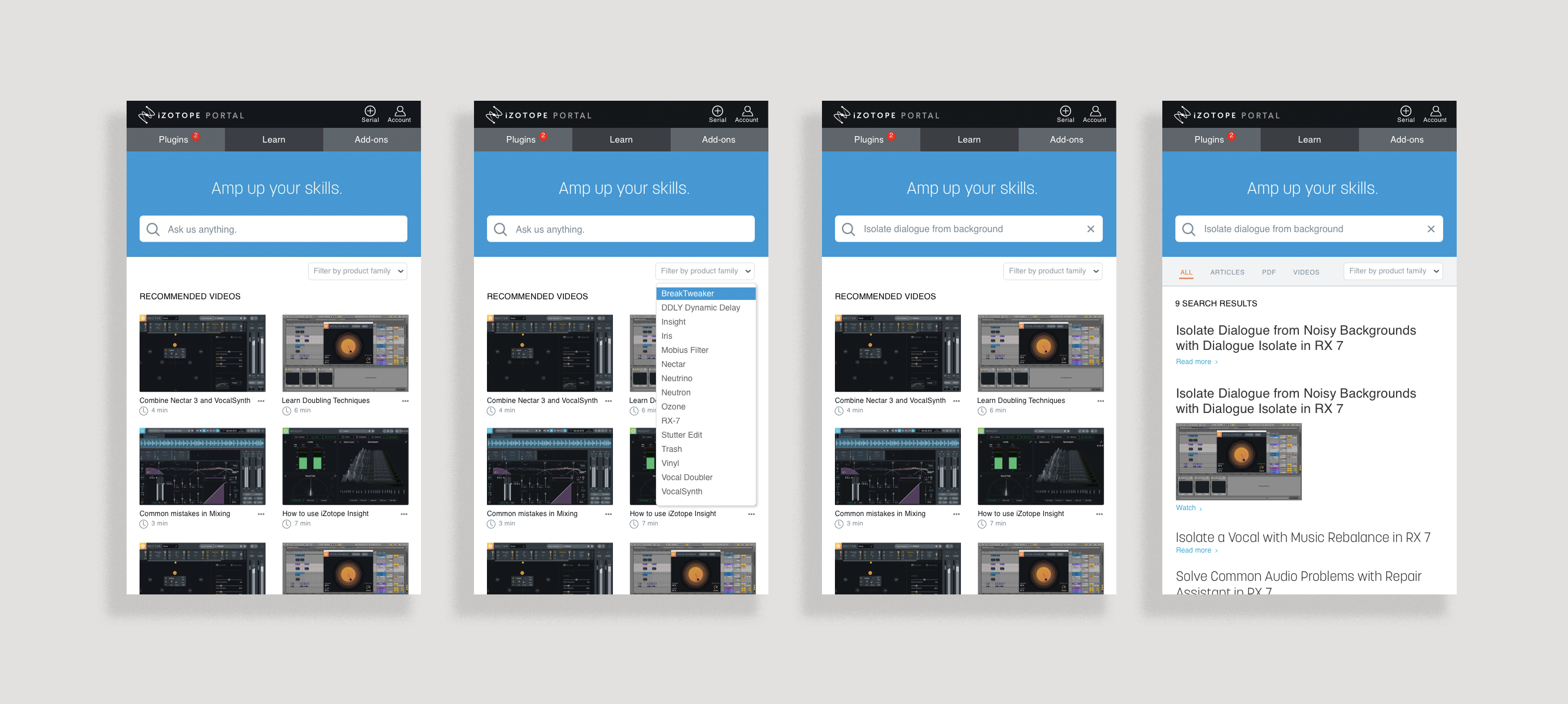
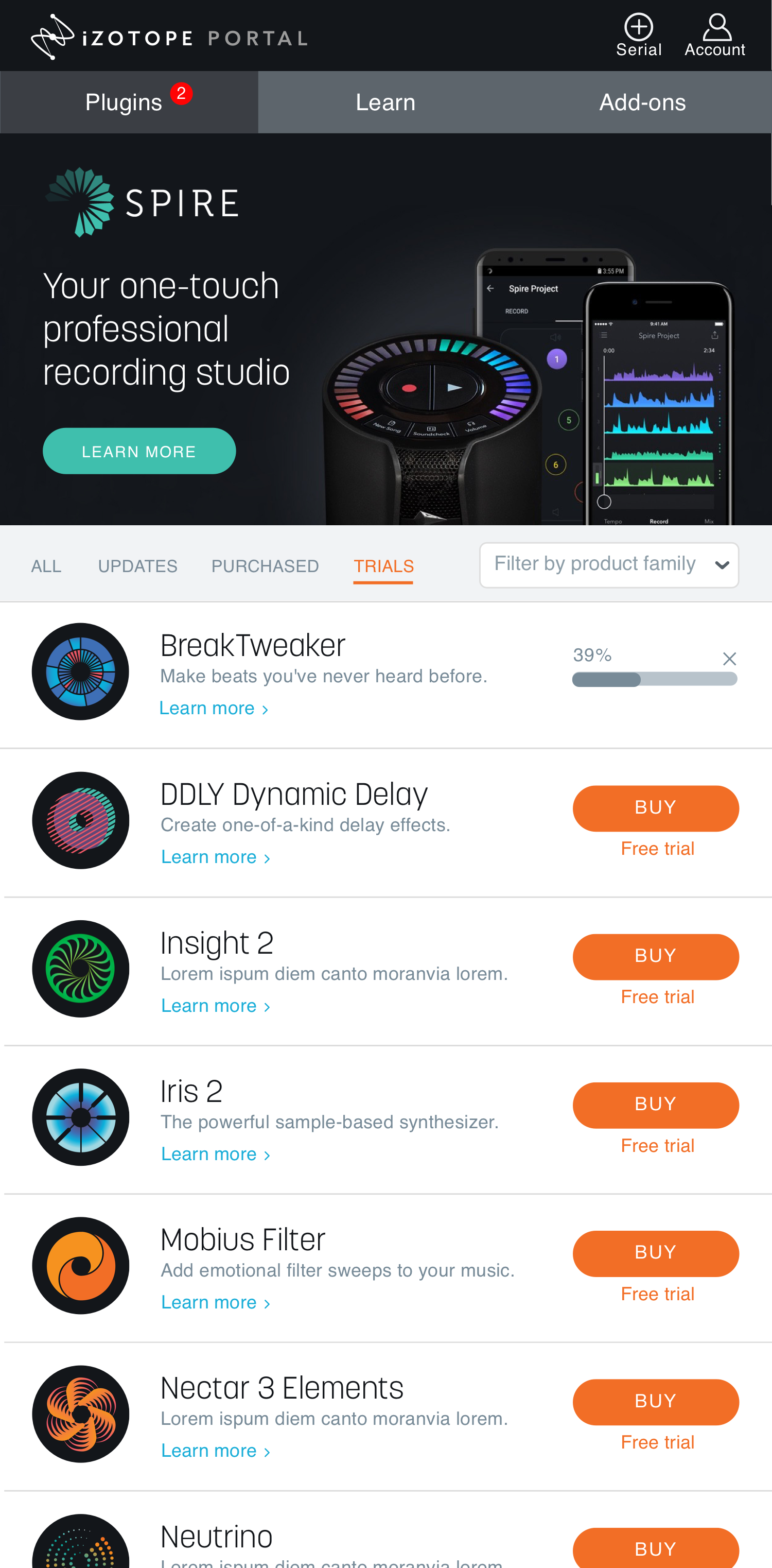
The final 'Learn' iteration allows users to search for a help-related question, click on relevant videos, or filter by product family in one place.
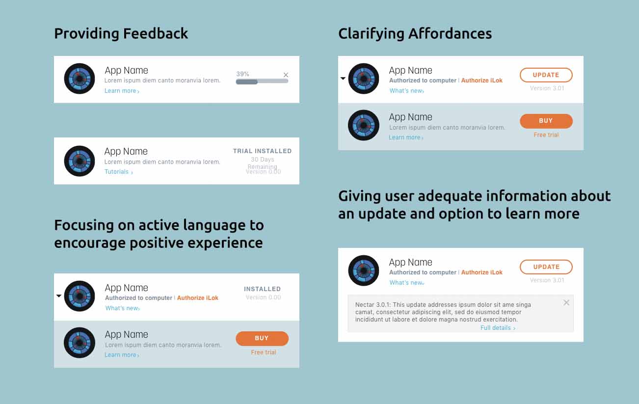
User Testing Validates Design Decisions
Our usability testing proved we needed to focus on organizing products that need updates first. One major change was providing additional feedback to the user to clarify the trial process. After a user initiates “Free Trial” they will see a countdown of days to ground them in the trial
We also agreed upon action-oriented colors. Blue indicates learning, while orange indicates an active download. We created a symbol library to apply to our design, focusing on providing adequate information while not visually overwhelming the user.
High-Fidelity Mockups
Directing User through Product Portal
I created an ideal journey throughout Product Portal. My idea was to lead the user throughout the application with alerts and calls-to-actions.
Users would then be engaged in all the features and directed to the learn tab once they updated or purchased a product.
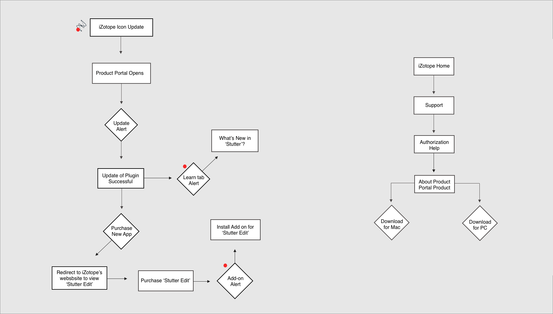
Left: Calls-to-actions direct the user through the portal. Right: The user flow to arrive at Product Portal from iZotope's website.
Calls-to-actions direct the user through the portal.
Next Steps in Process
- A/B testing to validate different layouts and information architecture systems
- Build a larger vision for Add-Ons to integrate free products into this section
- Improve the affordances of product families
- Reconcile language to account for all products
Contact
© 2024 Caro Henry. All rights reserved.
© 2024 Caro Henry. All rights reserved.