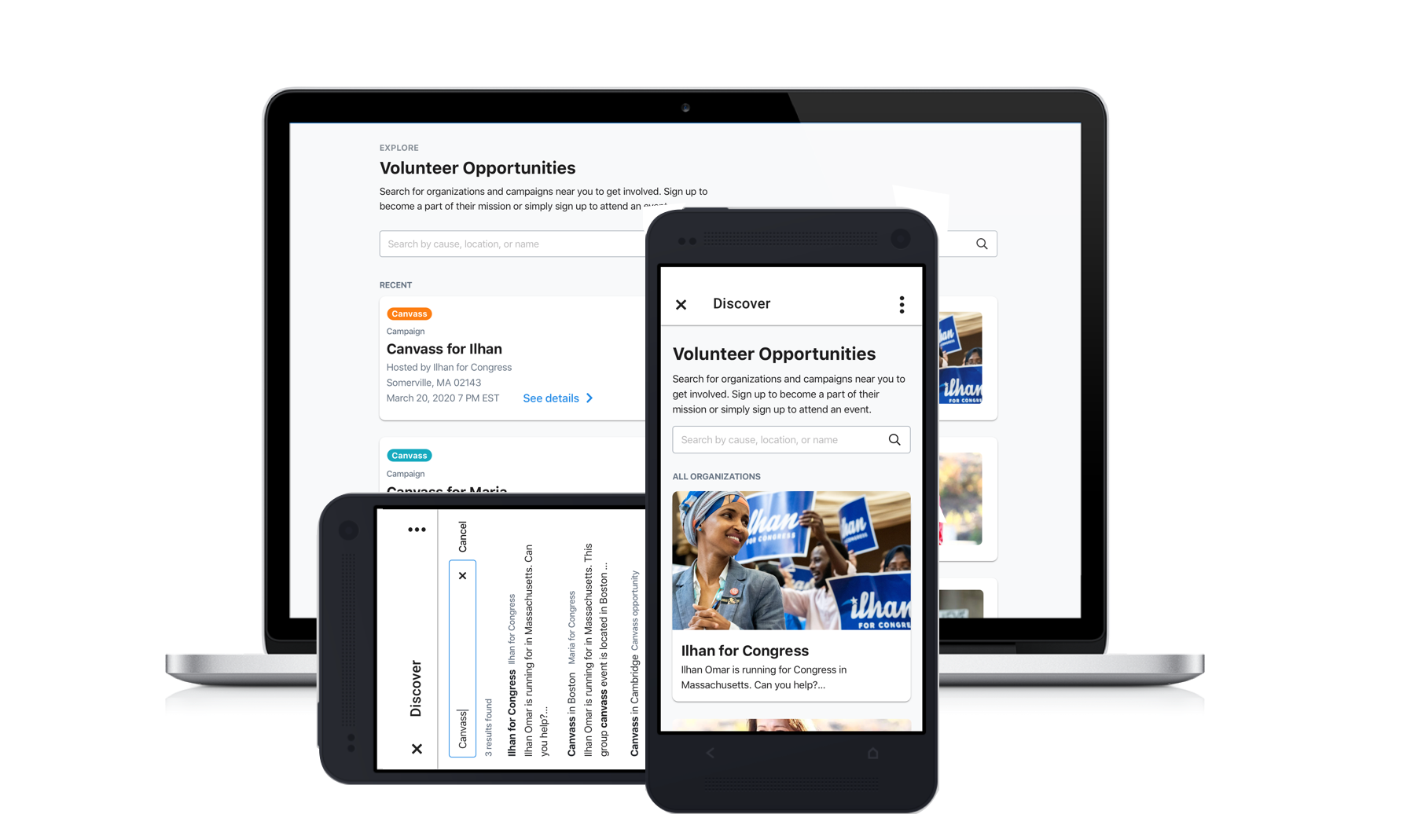
Mobile Community Organizing
About the Project
What is the best way to mobilize a massive pool of volunteers? How can we best solve for the need for a peer-to-peer network? For this project, we wanted to build a mobile tool for volunteers to join and engage with their broader community.
Capitalizing on the strategic and market advantage of our app was our business motivation. From a user perspective, activists who work on campaigns and non-profit organizations needed a centralized place to view all of their tasks.
Goal: Create a centralized hub for volunteers to seek new opportunities from campaigns and organizations.
Project Goals
The main goal of this project was simple: to allow volunteers to view and join community groups on a mobile device. We defined the success metrics by an increase in MiniVAN users and an increase in contact rate. We realized this feature could allow organizations an easy way to recruit new supporters. Potentially, we had 500k+ activists ready to join campaigns and organize relationally.
While we wanted to capitalize on this unique business advantage, I wanted to push us to focus on the user first with this feature, and consider their needs in this app. For the volunteer who will utilize this app on the campaign trail, what is their daily experience and how can we enhance it with this feature?
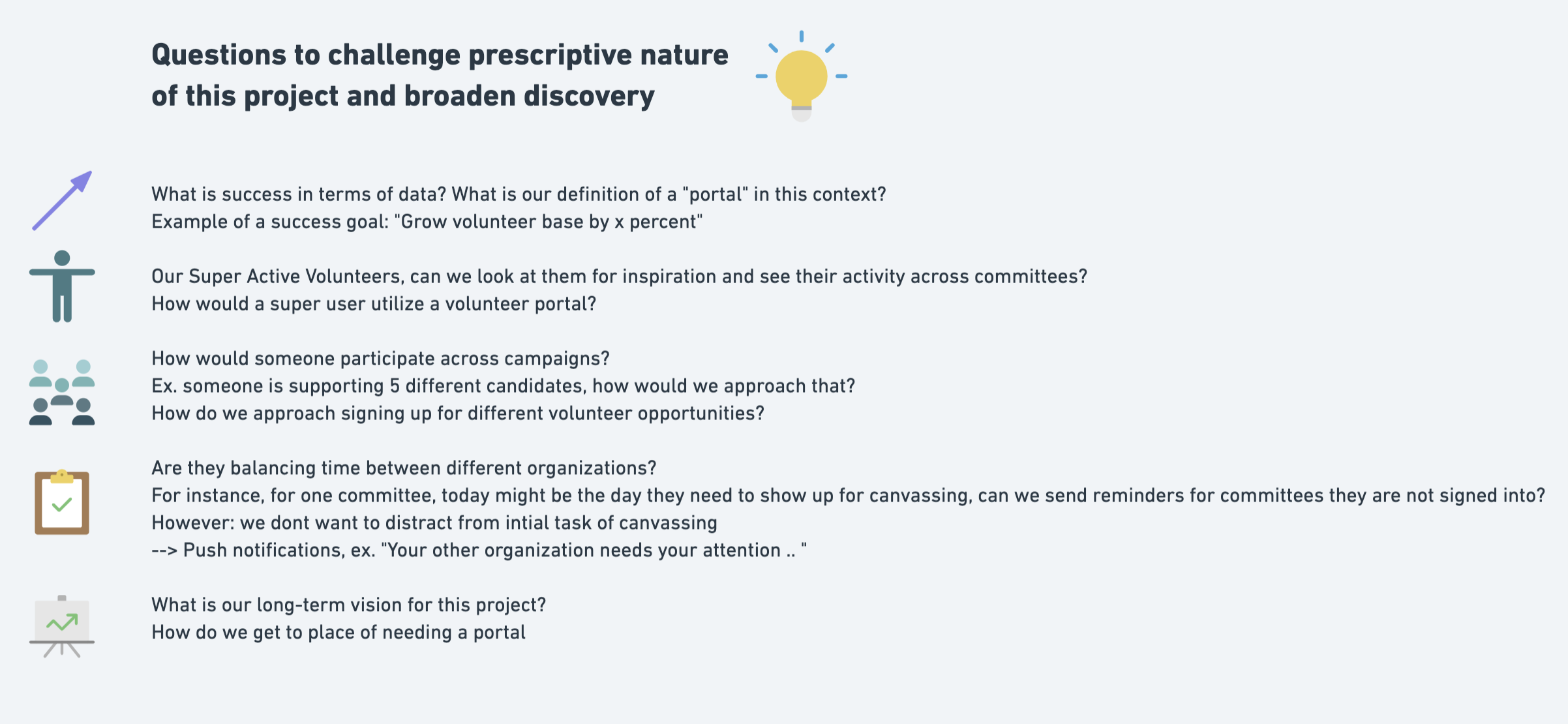
Example of questions I kept front-of-mind as I discussed this feature with stakeholders over the course of the project to push us to be user-first.
UX Solutions
Initially, I led a design session with stakeholders and engineers to define success metrics. With the exercises, I aimed to generate empathy for volunteers. The first exercise was to go roleplay the experience of a first time user. By focusing on the entire user journey, we were able to clarify (and truly empathize with) important points of frictions.
The next exercise was a group whiteboarding of the experience of someone moving through the initial on-boarding experience. Where do they “land,” how do they return to the 'Portal' after completing tasks, etc? Together we realized where users could get stuck, where we could entice them to continue through the experience.
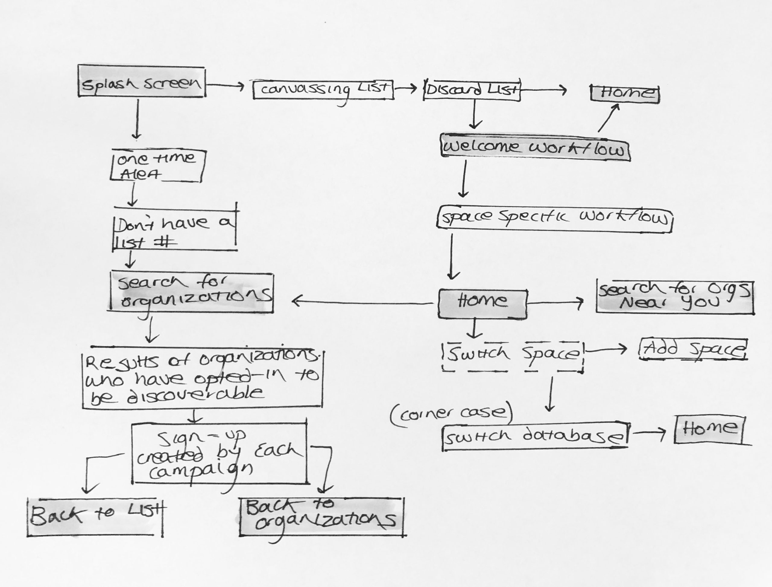
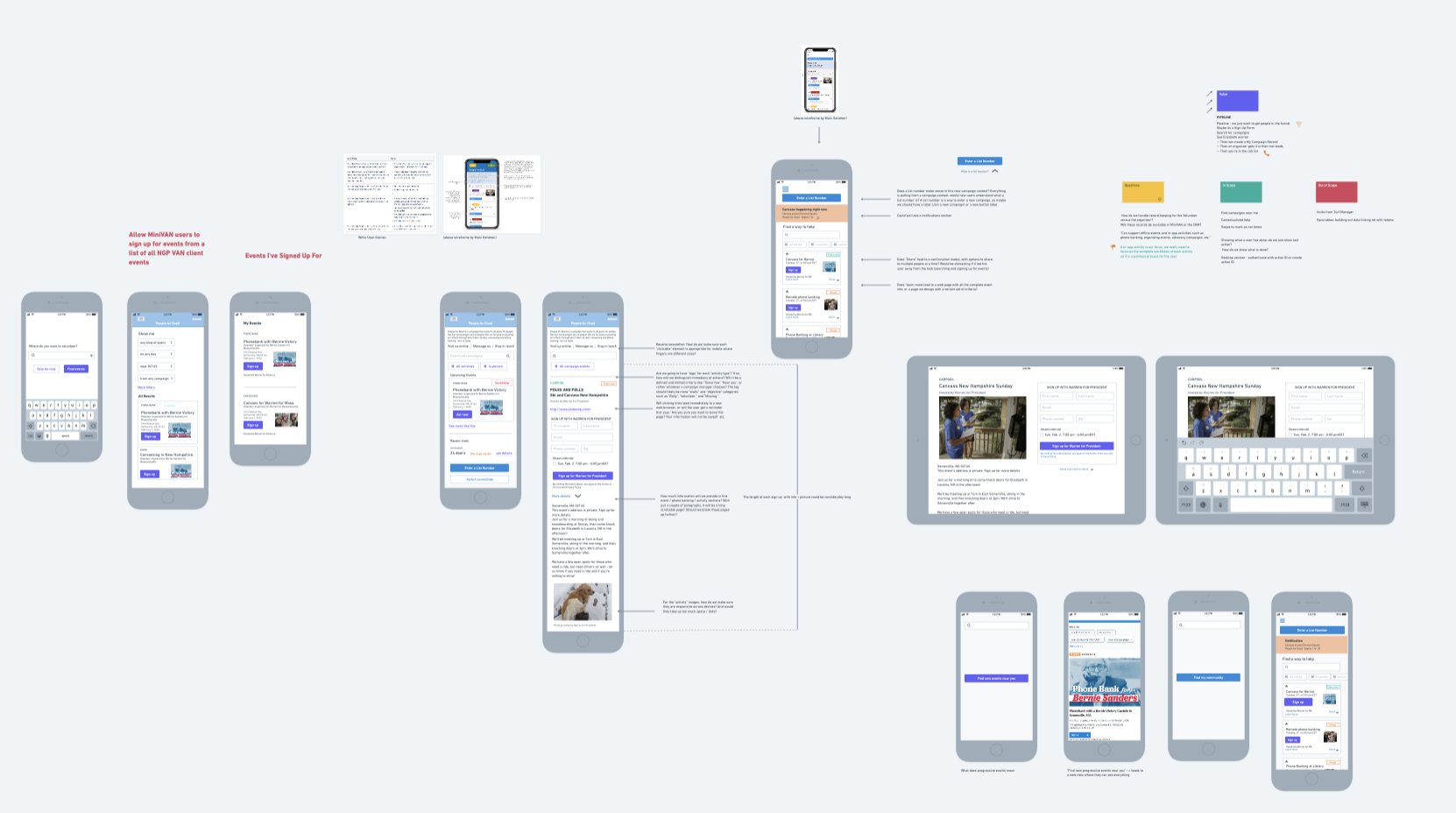
I laid the groundwork for empathy-first design with a focus on user pain points within onboarding.
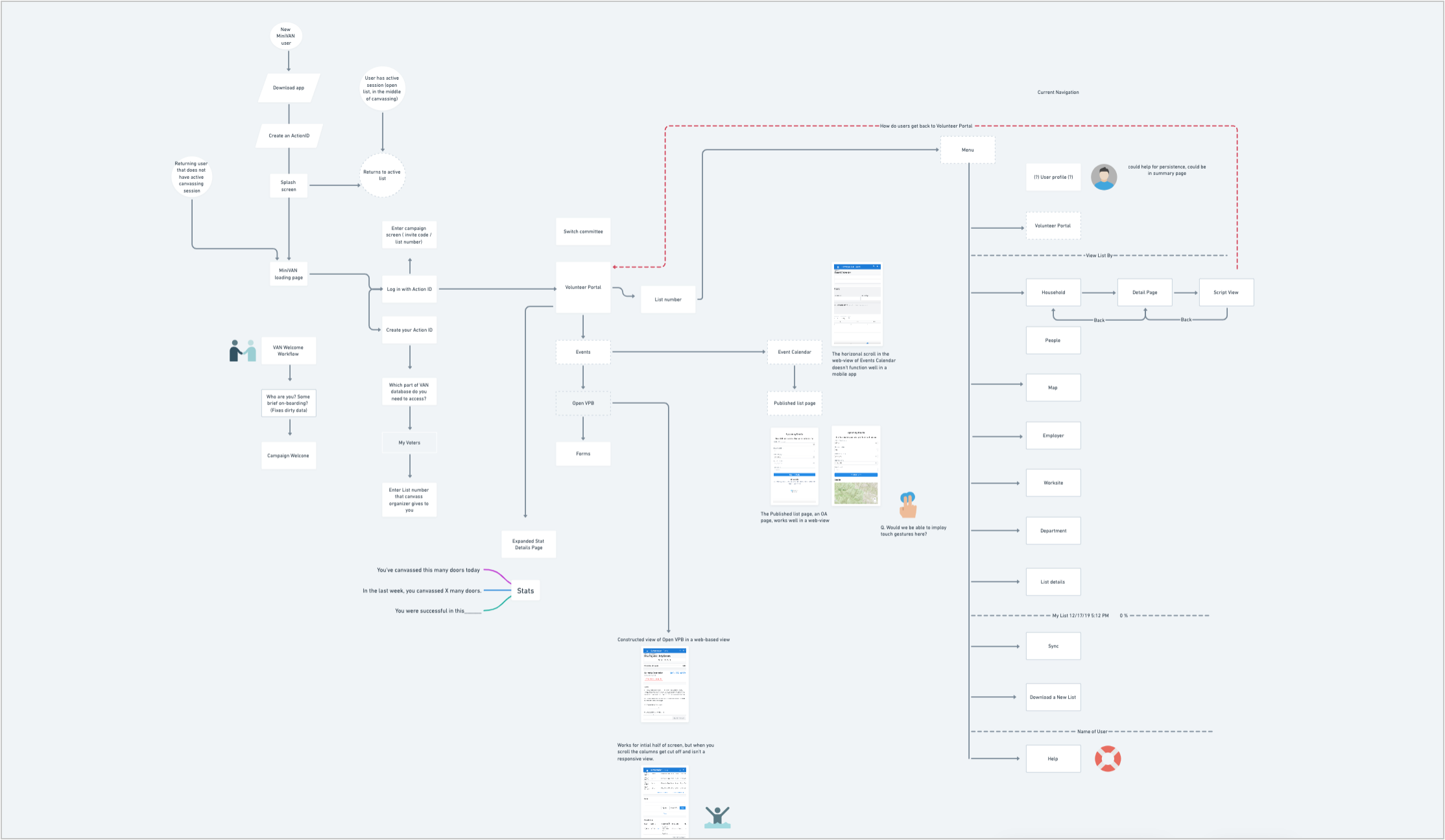
Above is the completed user flow I put together to show the areas of friction within the current workflow and demonstrate an ideal workflow.
Takeaways from Design Session
Our app replaces the typical role of a campaign organizer. How can we model the support and aid an organizing admin would provide to volunteers with the inline help of the app? How can we predict the areas in which our volunteers will need guidance ?
How can we ease their anxiety with visual cues and secure copy? The way we classify information primes our users. Are we classifying information in the right way? Is there an easier way to define what we are providing users?
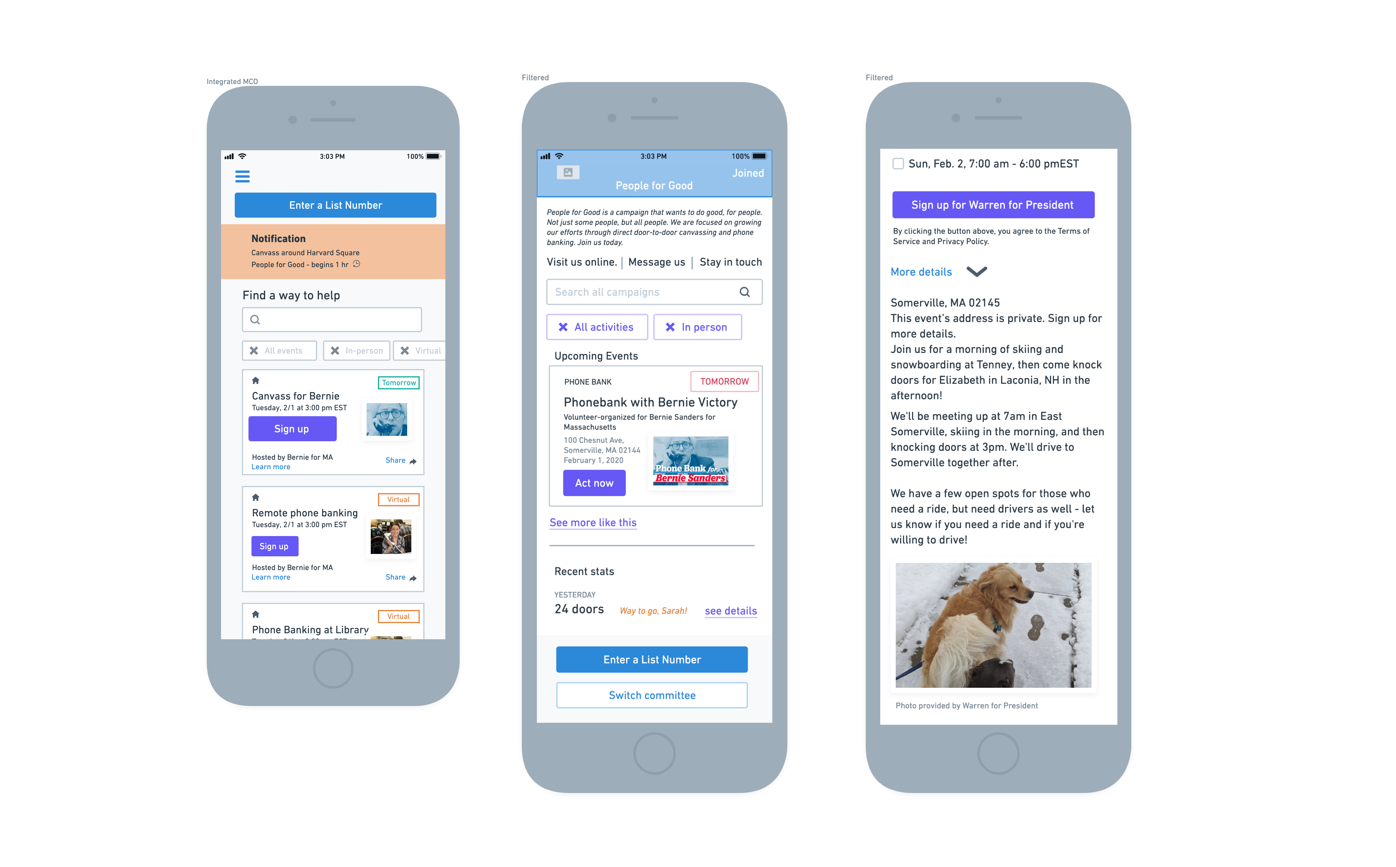
Crafting a human experience
I realized it was crucial to make this user experience more than a transactional process where a volunteer simply fills out forms. There were things we could do to make the web-app feel more “app-like" such as micro-animations, transitions, smooth scrolling, and rapid page refreshing. I also suggested we focus other elements such as:
- Human language over technical terminology
- Large calls-to-action to guide users throughout the app
- Reassurance that supporters actions are significant (reinforcing value and securing their motivation)
- An urging to users to respect others with a "first notice"
- No excessive visual noise so users can focus on tasks
Final Design
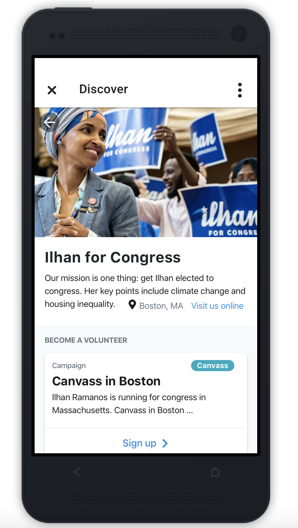
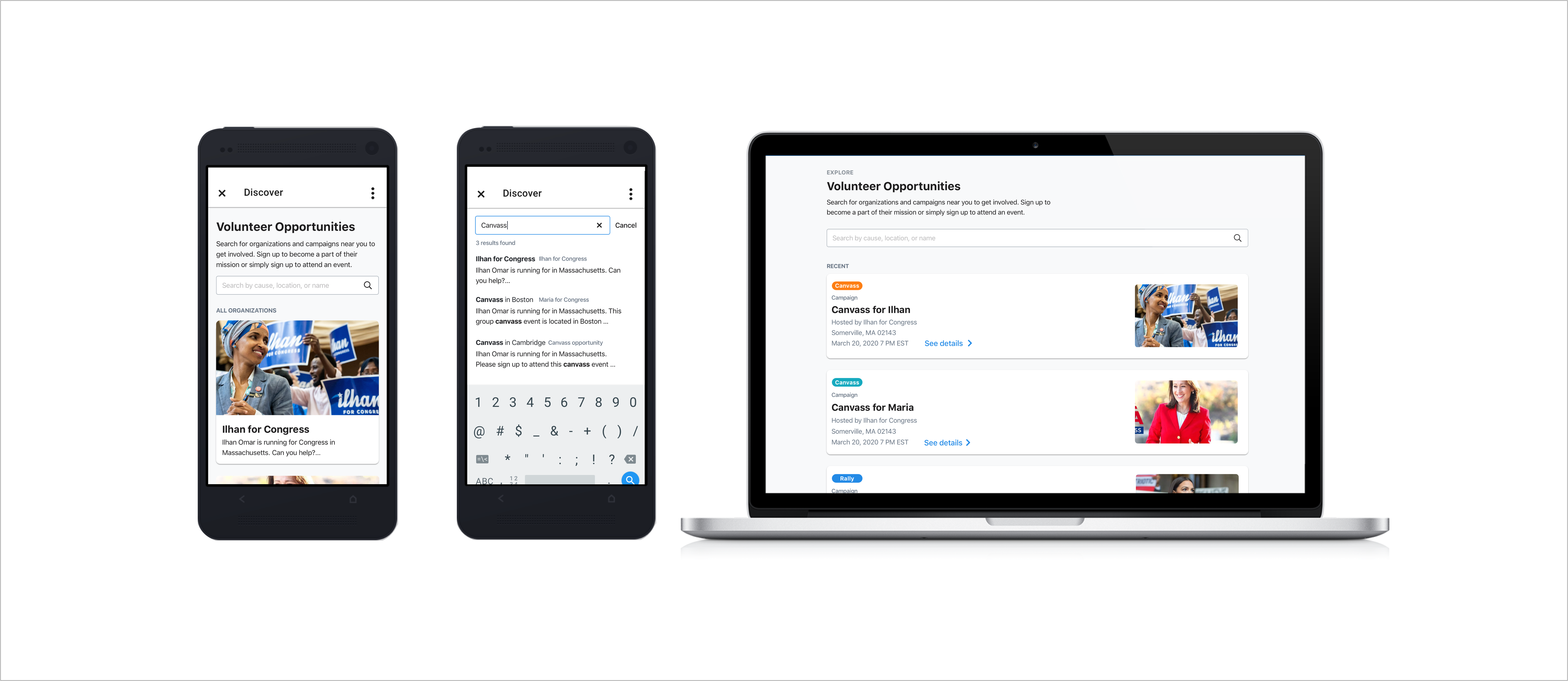
I finalized upon an interchangeable and enticing "card" for each organization to be displayed in the portal or “home.” Organizations would have the ability to opt-in or out, in the case that they choose to keep their events private. This scalable UI provided the ability for volunteers to discover new opportunities while also offering organizers and campaigns more visibility.
Contact
© 2024 Caro Henry. All rights reserved.
© 2024 Caro Henry. All rights reserved.
