Virtual Phone Bank Connect
A New Context
The pandemic changed a lot, including how people contacted voters and campaigned. Campaigners were accustomed to using our OpenVPB program - a tool where volunteers can go through a public link to call voters with a script. In this new context, however, people were calling from their homes, with plenty of distractions. Our tool needed to be as easy to use as possible, and keep the user focused on the task at hand.
When deciding what would go into the MVP, I first conducted competitive research to see what users were expecting in this type of feature. From a business perspective, we really needed our tool to be more ‘usable’ than other competitors. After all, this was a landscape where people were generally using one tool for all of their canvassing needs.
UX Solutions
While we had settled on a general concept for this tool, now called, "VPB Connect," I focused my design process around the principles of flexibility and ease of use. I wondered how we could present information in a way that would allow people to grasp intuitively where to click in a fast-paced, often stressful calling experience. I wondered how we could reduce the amount of clicks that it took someone to call a target.
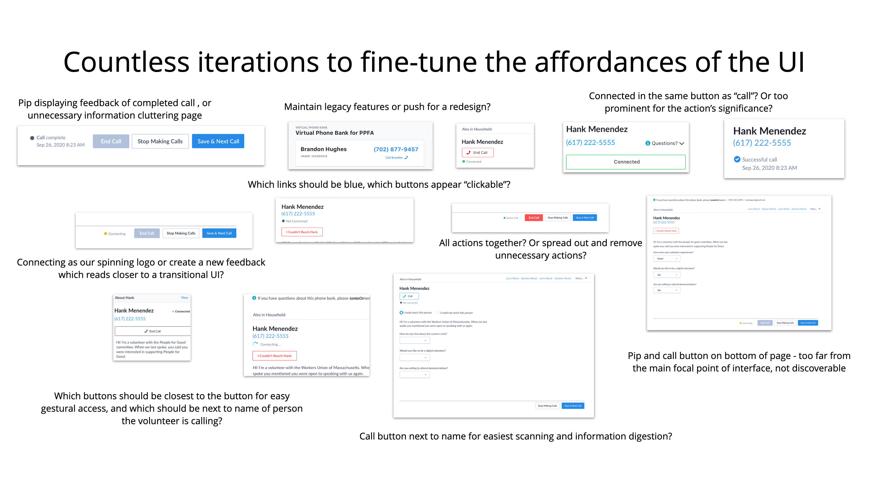
It turned out that user testing would be invaluable for fine-tuning the buttons and UI functionality. After all, when you are working with something as critical as a voter calling feature, small affordances take on vast importance. The UI indicating that the feature is calling a voter, for instance, needs to blend with the mental model that users already have in place while also being differentiated from the other UI elements on our interface.
Usability Test Takeaways
The usability tests confirmed there was confusion around where to start, how to call, and how to end the call. The “connected” and “connecting” pips were misleading at first, and certain buttons were deemed unnecessary.
Ultimately, for a tool that would take place in a high-stress situation of calling voters who may not want to be called -- we needed every button to be explicitly clear.
Final Design
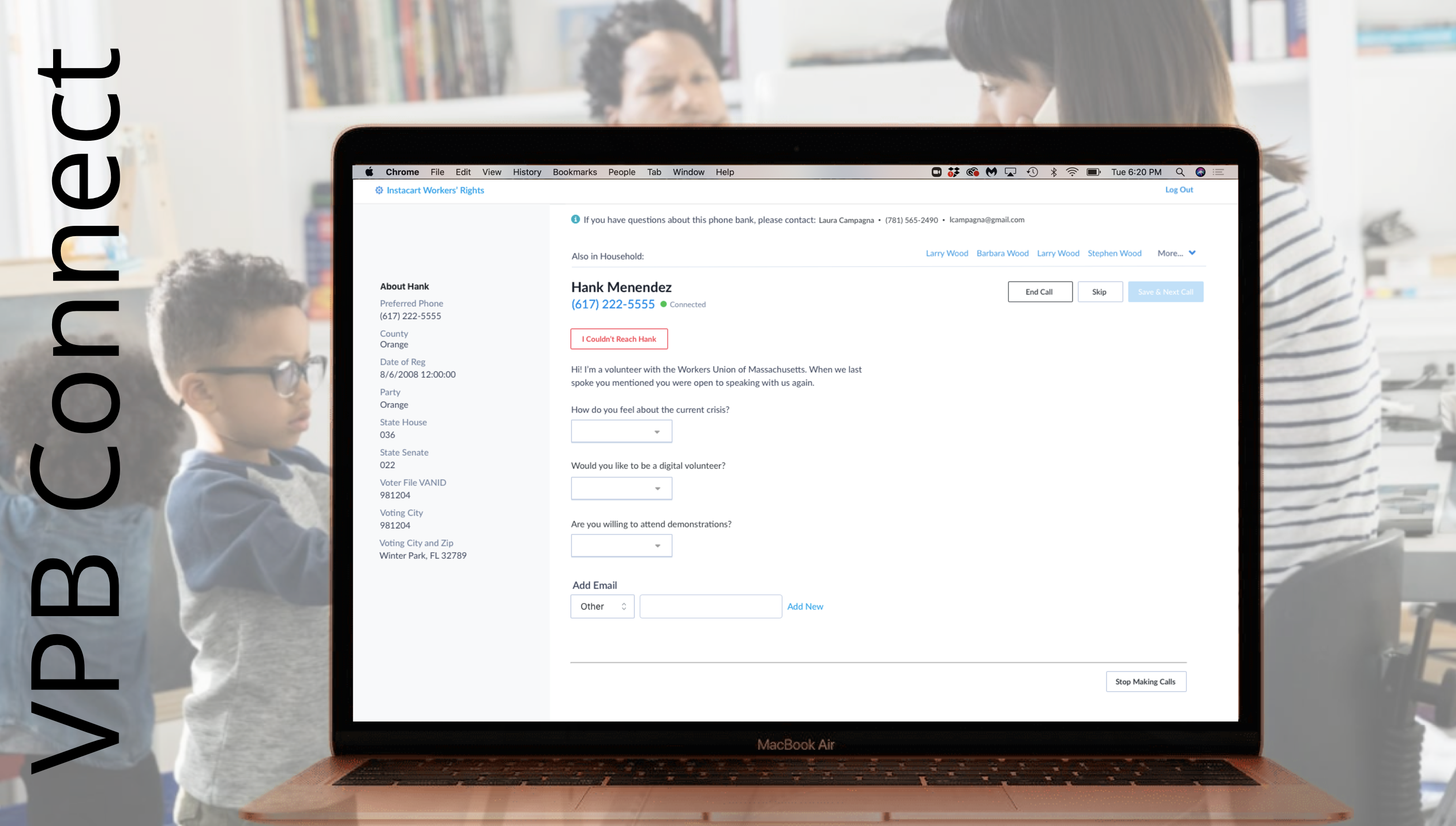
In lieu of proper user testing due to restrictions from lockdown, I was able to test the tool with numerous coworkers from other departments who were unfamiliar with the tool. With collaboration with product managers and other designers, I arrived at a final version which focused on clarity and ease of use.
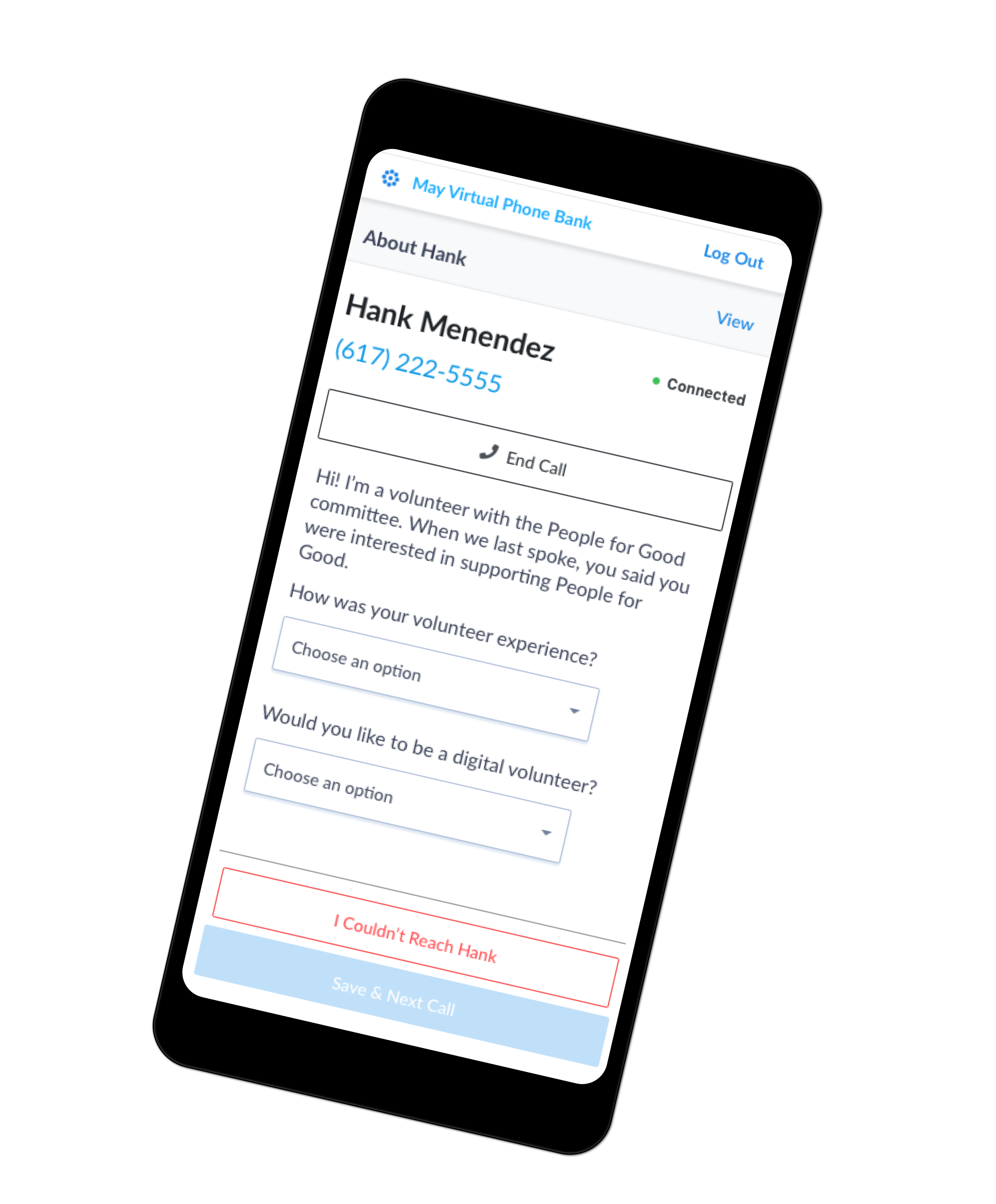
This version addressed the need to include "About" information with progressive disclosure, a clear "on" and "off" function for calling folks, and a script to carefully guide the caller through the process.
The mobile version of VPB Connect involved consideration of responsive stacking and placement of buttons which were easily accessed for the most crucial actions.
This tool, while simple, was effective in that it was easy to navigate and use, even for beginners.
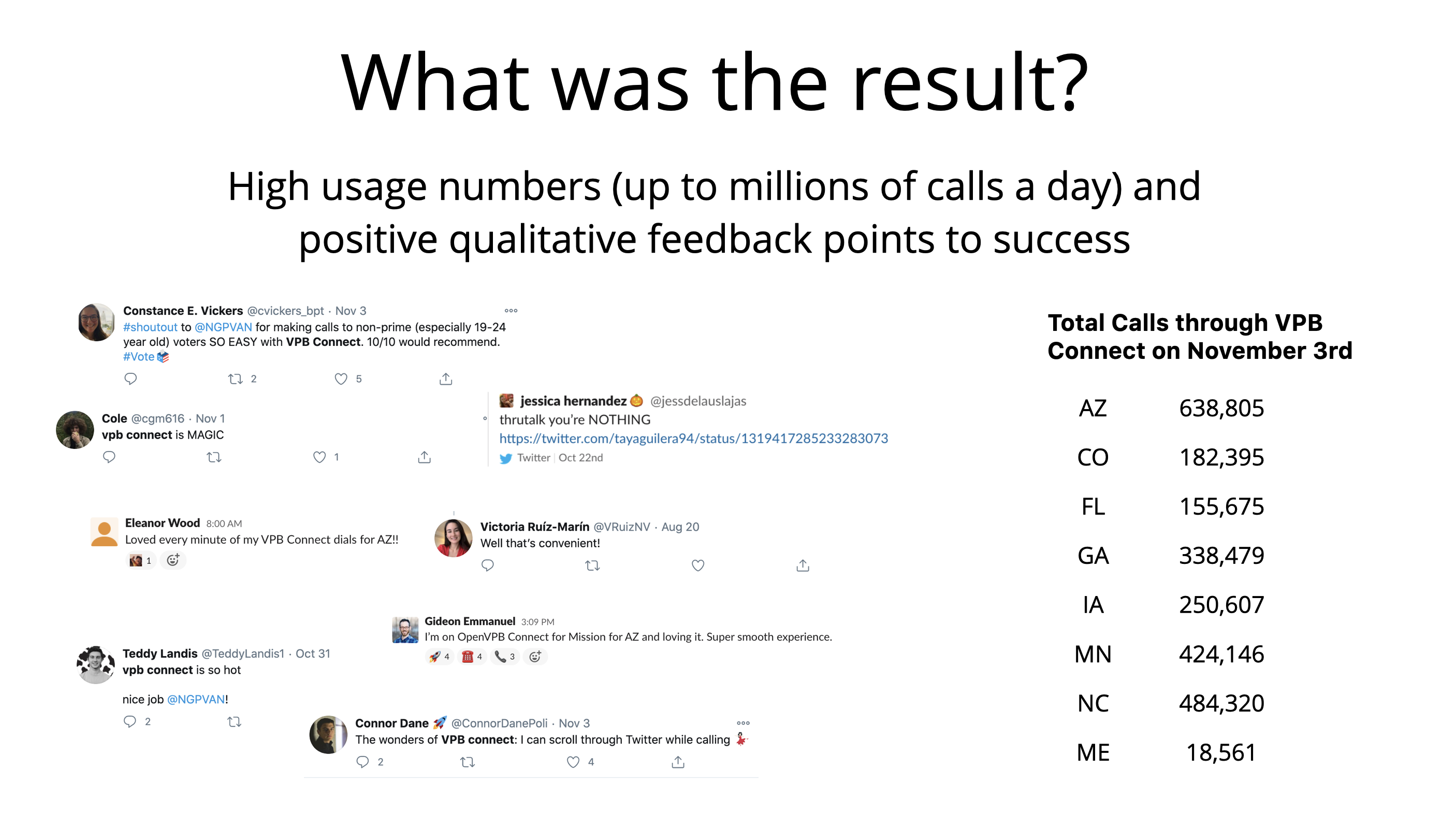
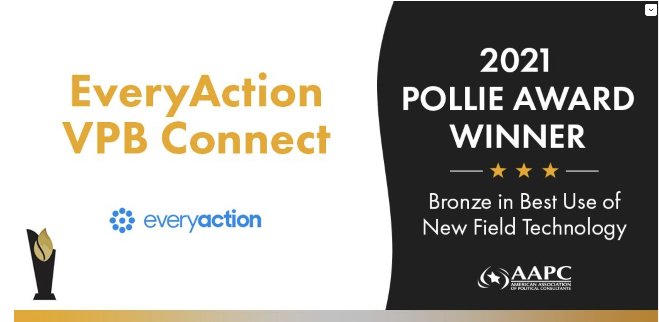
VPB Connect Wins Bronze in Best Use of New Field Technology in 2021 Pollie Awards
My exploration next steps: Visioning for a Gamified Progress Bar
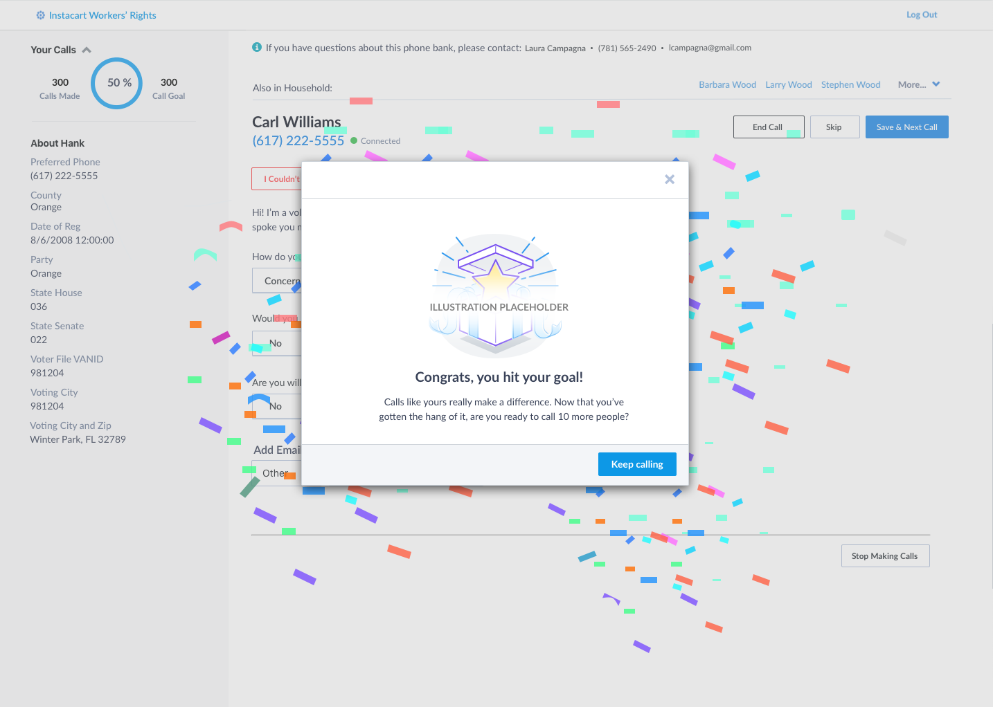
In further iterations, I'd like to consider adding a progress bar and gamification feature to VPB Connect. In the often stale process of calling people, this addition could offer a rewarding push to motivate folks to move forward in the calling process.
Contact
© 2024 Caro Henry. All rights reserved.
© 2024 Caro Henry. All rights reserved.